This project involved creating studio photographs to feature in an article about Italian pasta. The objective was to design a magazine cover and two interior pages for the article’s publication. My responsibilities encompassed all aspects of the studio shoot, including lighting, colour composition, and food arrangement, to produce high-quality culinary photos for the magazine.
To start, I determined the narrative I wanted to convey about pasta—whether to focus on specific dishes, various types of pasta, or interesting facts. With this narrative in mind, I planned the types of photos that would best complement the article.
My approach to food photography followed a systematic process:
Research: I reviewed various food magazines to understand current trends and effective photography styles.
Lighting and Equipment: I explored the light effects achievable with my equipment and selected suitable studio light setups for still photography.
Preparation: I purchased several types of pasta and experimented with different design variations.
Execution: I set up my camera and lighting for the shoot, carefully arranging the pasta to capture visually appealing compositions.
Post-Production: After the shoot, I organized the photos in Lightroom and edited them using both Lightroom and Photoshop to enhance their quality.
The result was a series of professionally crafted images that effectively conveyed the beauty and diversity of Italian pasta, aligning with the article's content and aesthetic.
The layout of the magazine cover
The magazine article
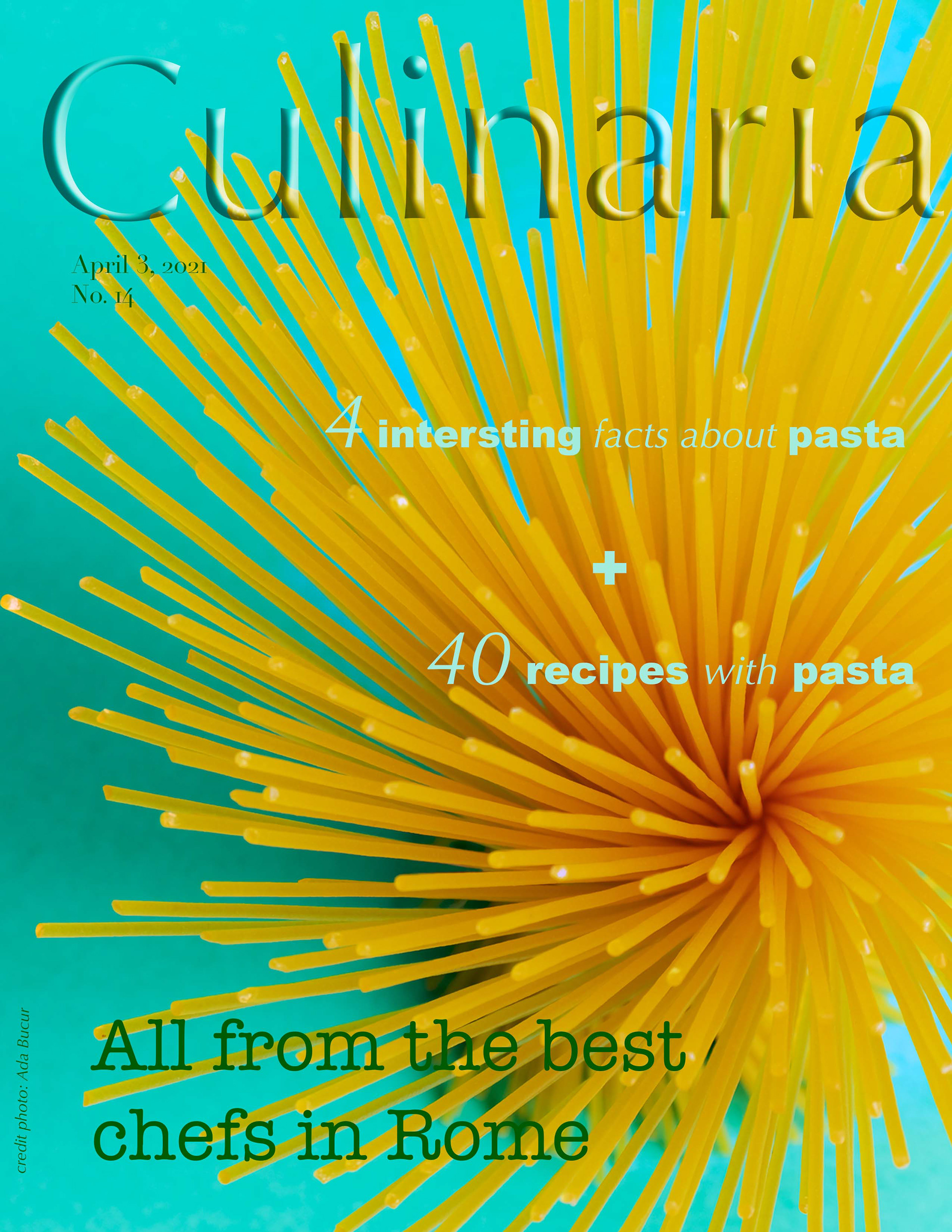
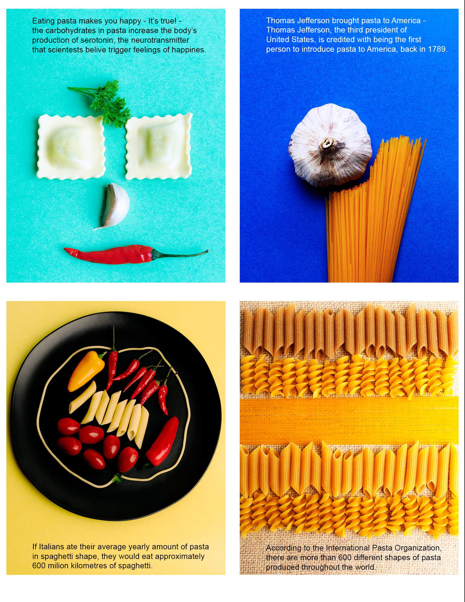
The layout for the cover and magazine pages
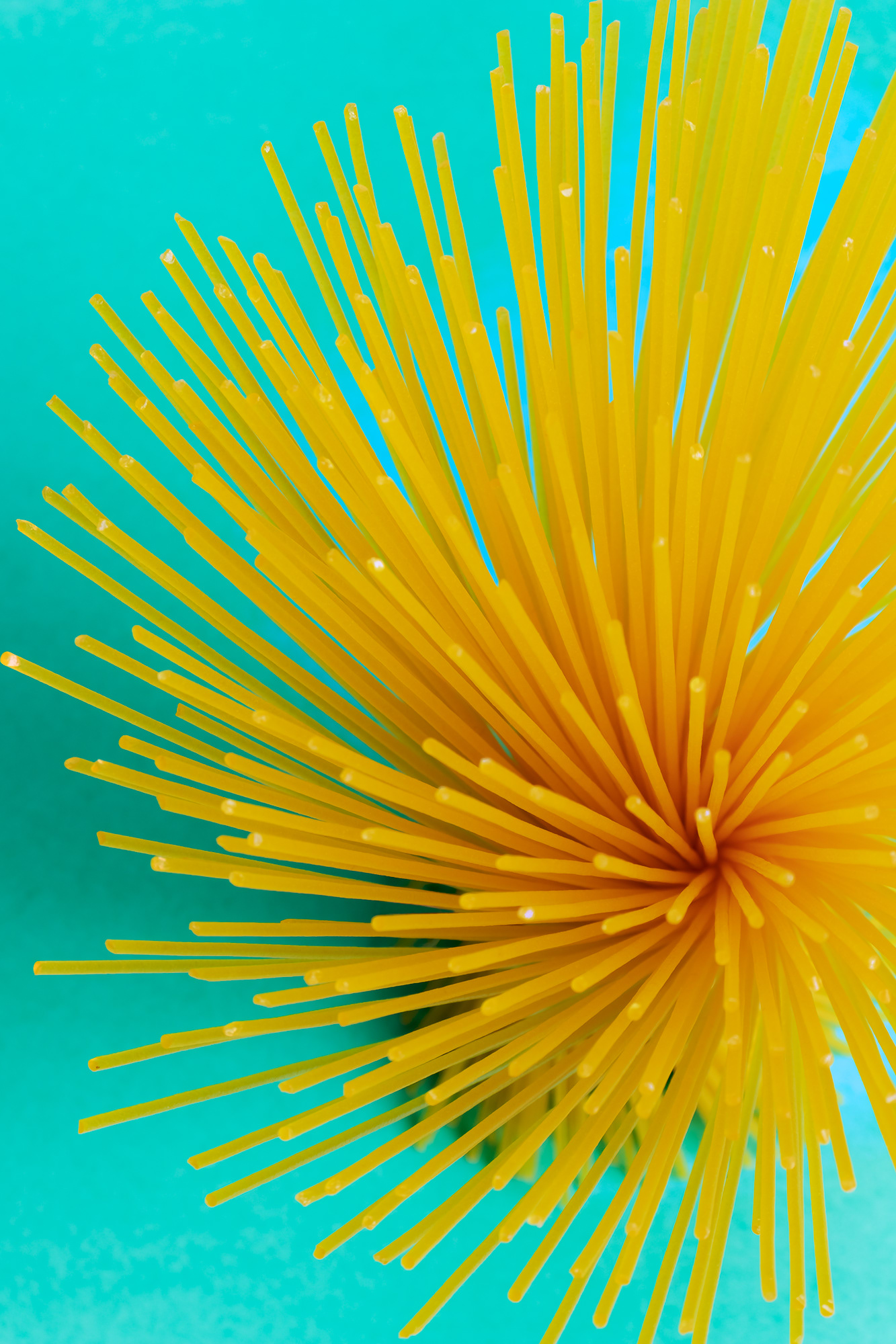
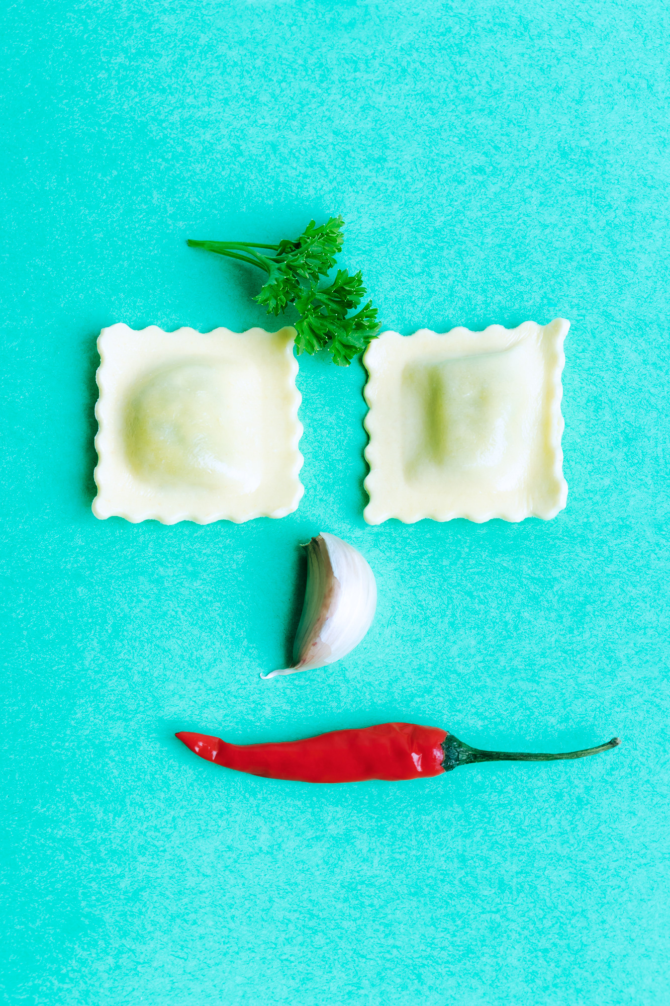
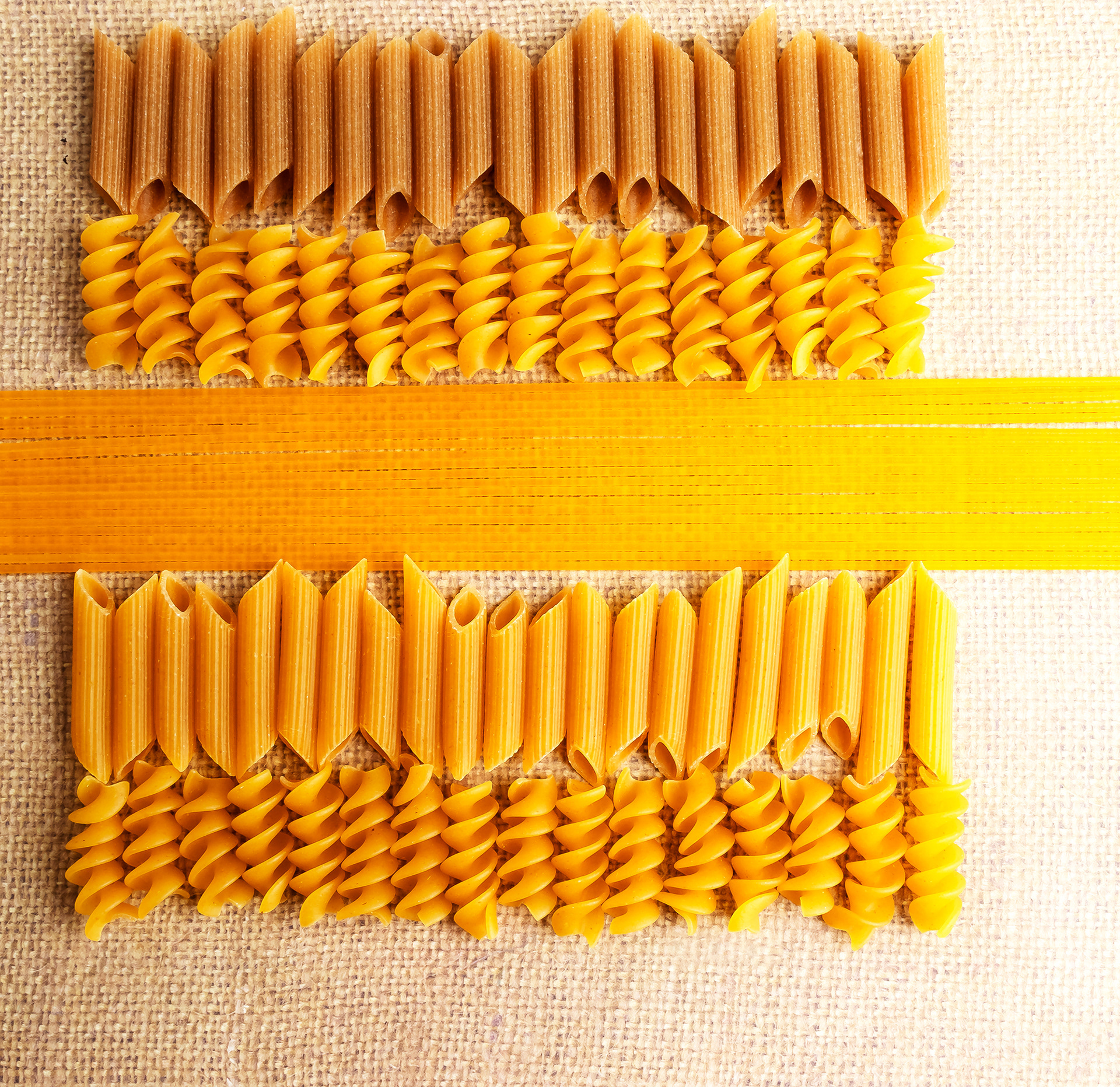
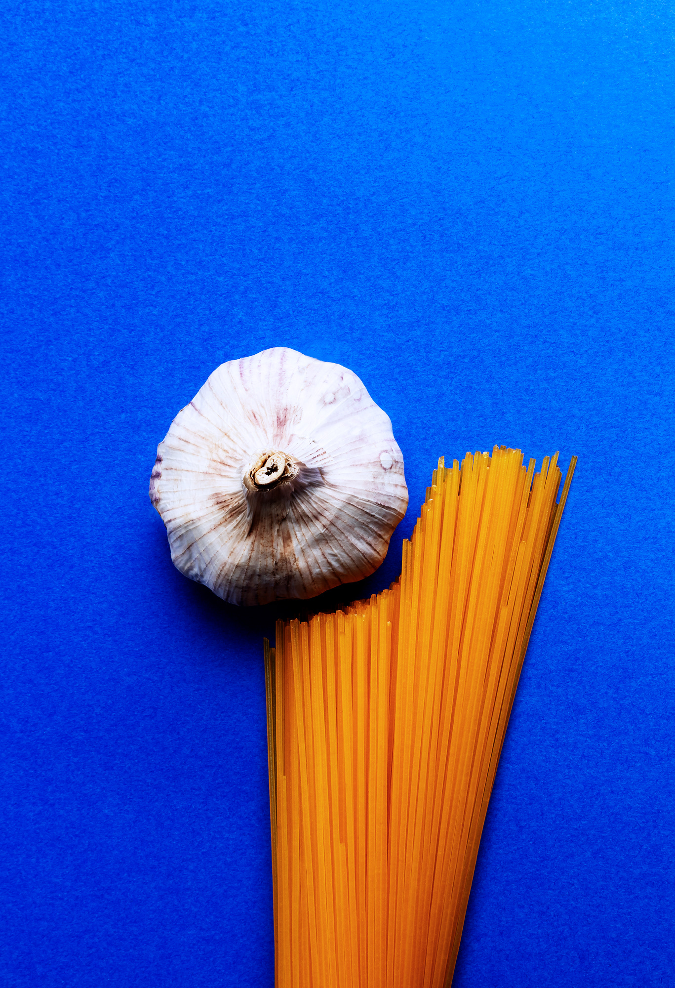
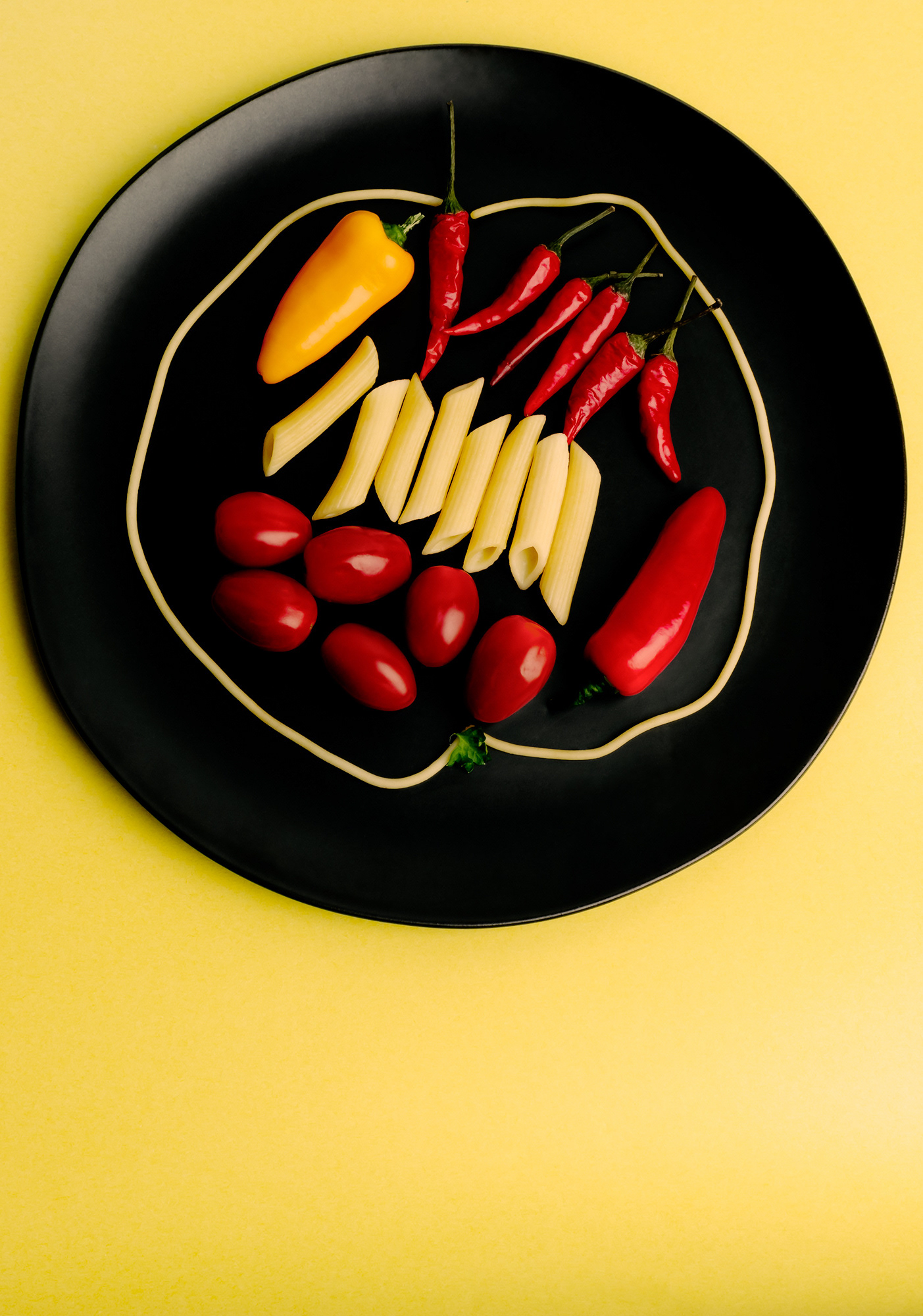
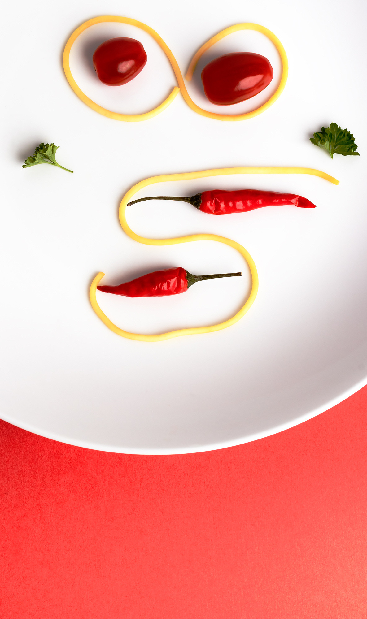
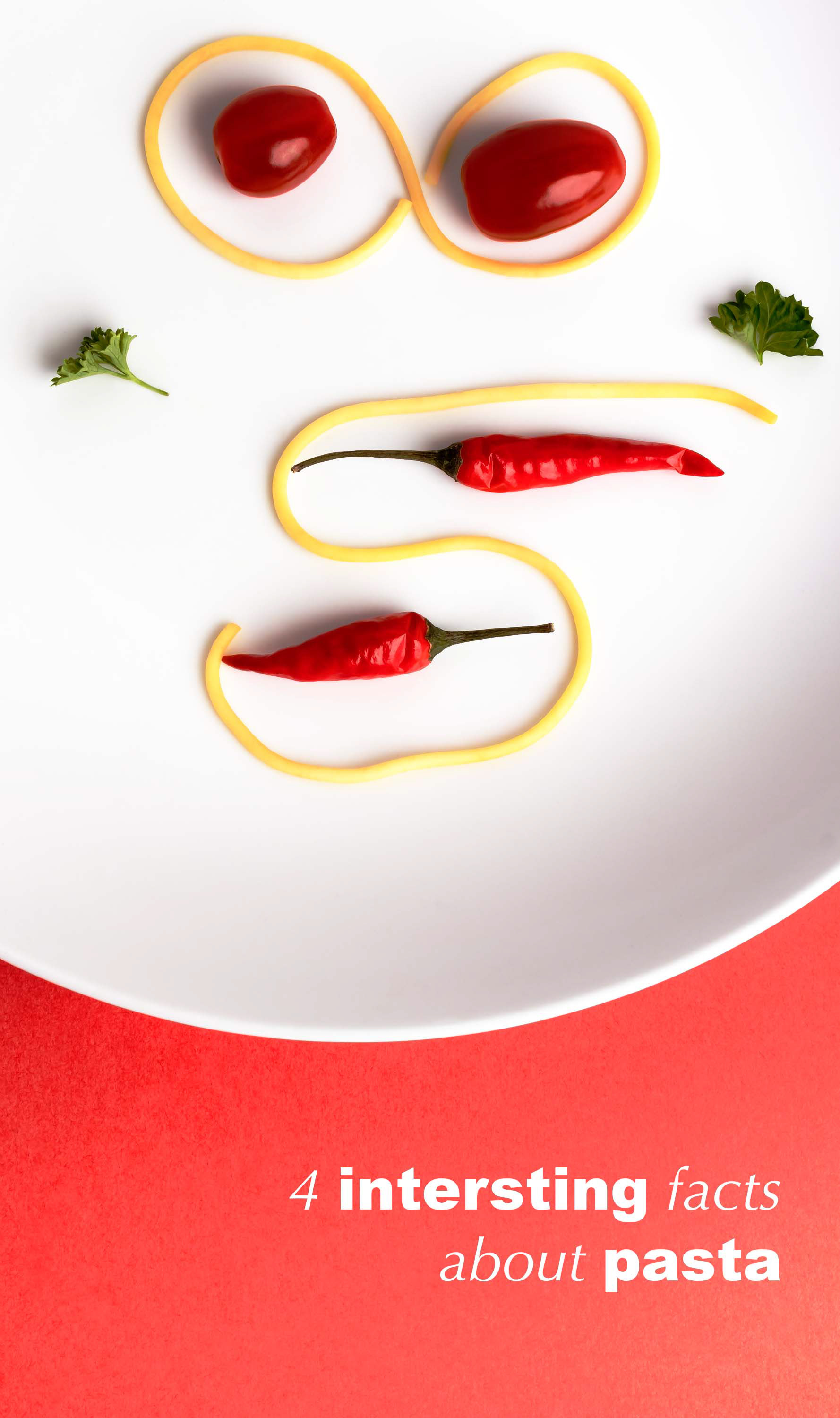
The final photos for the article
